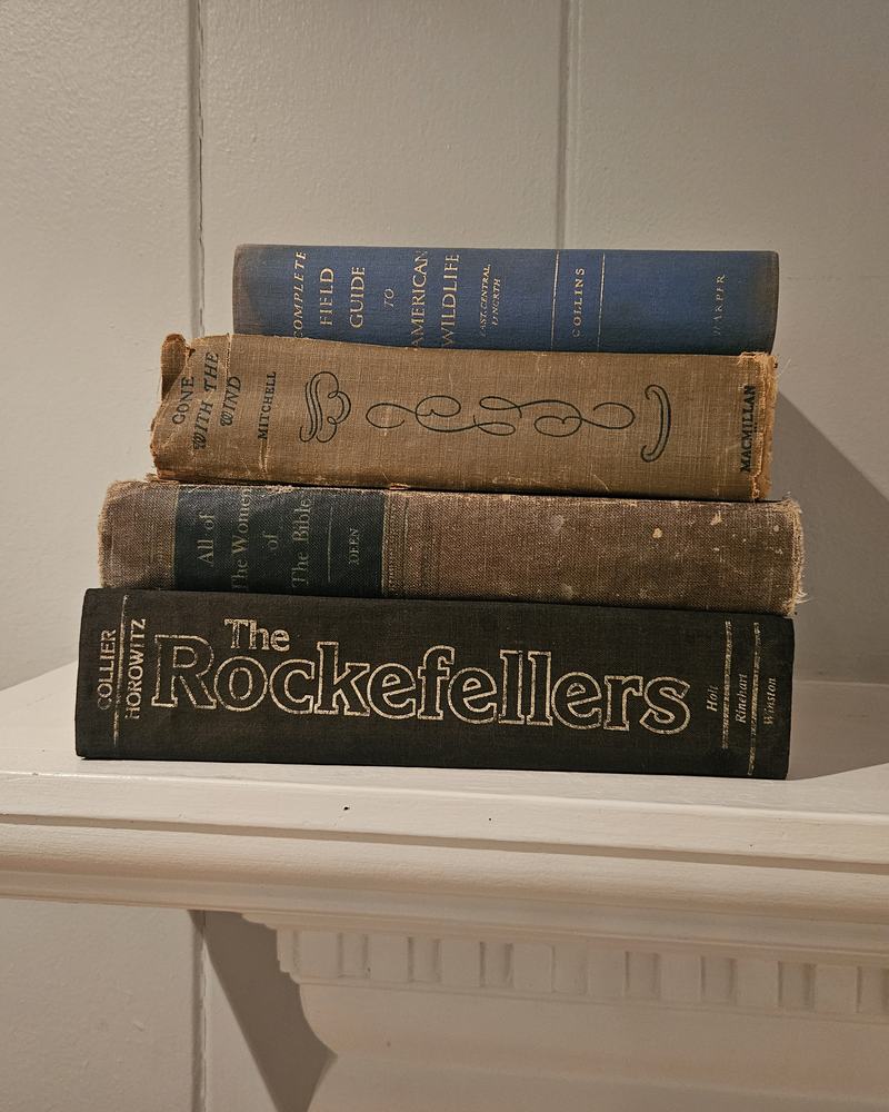
Styling guide
Bookshelf Color Palettes: Best Book Colors for Every Room
The right book colors depend on what a room is for. A living room needs to feel welcoming and balanced, an office focused, a bedroom calm. Below are palettes for each room, with ratios and the objects that finish them.
All palettes use a simple 60-30-10 split: about 60% main color, 30% supporting color, 10% accent. For how many feet each shelf needs, see how many books per foot of shelf.
How to choose for any room
- Look at the three biggest surfaces: walls, the largest piece of furniture, and the floor or rug.
- Choose a main book color that repeats one of them, or a neutral if the room is already colorful.
- Choose a support color that contrasts a little with the shelf itself (light books on dark shelves, or the reverse).
- Add an accent from a pillow, a print or a plant.
Living room
The living room shelf is seen most and photographed most. Aim for balance and warmth.
Palette A: warm neutral - 60% Dunes cream and ivory - 30% Driftwood tan and brown - 10% navy or green - Pair with: wood bowls, a trailing plant, a framed print.
Palette B: coastal - 60% cream, 30% Tidewater navy and blue, 10% aqua - Or simply the pre-mixed Sandbridge navy and cream lot - Pair with: rattan, rope, white ceramics.
Home office
Offices benefit from contrast and structure; they also appear behind you on video calls.
Palette: modern contrast - 60% Storm black and charcoal - 30% cream - 10% tan or brass objects - Pair with: a desk lamp, a single plant, a framed diploma or print.
Alternative: classic study - 60% navy, 30% tan, 10% burgundy - Pair with: leather, brass, dark wood.
Video-call tip: keep the shelf directly behind your head simple, with an object or open space rather than a busy run of spines.
Primary bedroom
Keep contrast low and colors soft.
Palette: soft calm - 60% cream and ivory - 30% Sea Glass aqua or sage green - 10% tan - Pair with: linen boxes, a small lamp, a ceramic dish for jewelry.
Bedrooms rarely need more than a shelf or two of books. A short stack on each nightstand is often enough.
Guest room
Guests should feel welcome and oriented.
Palette: friendly neutral with a local accent - 60% cream, 30% tan, 10% a color tied to your area (navy for the coast, green for the mountains) - Include a few books guests might actually read: a local guide, short stories, a puzzle book.
Dining room
Dining rooms suit rich, warm colors, especially under evening light.
Palette: warm library - 60% Autumn Oak burgundy and rust - 30% tan and brown - 10% cream - Pair with: brass candlesticks, pottery, a bowl of seasonal fruit or greenery.
Kitchen open shelving
Keep books away from the stove and sink, and keep the run short.
Palette: fresh and light - 60% cream, 30% First Day of Spring green, 10% tan - Pair with: white dishes, wooden boards, a small herb pot.
A short cream run on an upper shelf, mixed with everyday cookbooks below, looks natural.
Nursery and kids' rooms
Nurseries can go soft; older kids' rooms can handle more color.
Nursery: 60% cream, 30% sage green or pale aqua, 10% tan. Kids' room or playroom: a rainbow or multicolor shelf is fun here. Keep favorite picture books low and reachable, and decorative books up high.
Entryway and console
A console sees one glance at a time, so go simple.
Palette: two short stacks in the home's main palette, often cream and navy or cream and tan, with a bowl and a lamp.
Bathroom
Only with good ventilation. Books and humidity are a poor match; the Library of Congress recommends a relatively dry environment of about 30 to 55 percent relative humidity for most books.
Palette: a tiny stack of aqua or cream on a shelf well away from the shower.
Whole-home consistency
If your rooms flow into one another, choose one neutral that runs through every room (cream is easiest) and change only the accent from room to room: navy in the living room, green in the kitchen, aqua in the bedroom. The house will feel connected without every room looking the same.
Open-plan homes
When the living room, dining area and kitchen share one space, shelves in all three are seen together. Treat them as one room:
- Choose one main book color for every shelf in the open area, usually cream or tan.
- Assign the accent by zone: navy on the living room bookcase, green on the kitchen shelf, burgundy on the dining hutch. Keep the accents in the same depth (all muted, or all rich).
- Repeat the main color on the coffee table and the console to tie the zones together.
Matching books to your rug and textiles
The rug is often the biggest pattern in a room. Pull your accent book color from a secondary color in the rug or pillows rather than the dominant one. The shelf will relate to the room without matching it too literally.
Palette mistakes to avoid
- Picking from the books instead of the room. Start with the sofa, rug and walls.
- Too many accents. One accent per room is plenty; three accents become a rainbow.
- Matching the shelf exactly. Tan books on tan oak shelves disappear. Go a shade lighter or darker.
Quick reference
| Room | Main | Support | Accent |
|---|---|---|---|
| Living room | Cream | Tan | Navy or green |
| Office | Black and charcoal | Cream | Tan |
| Bedroom | Cream | Aqua or sage | Tan |
| Guest room | Cream | Tan | Local color |
| Dining room | Burgundy and rust | Tan | Cream |
| Kitchen | Cream | Green | Tan |
| Nursery | Cream | Sage or aqua | Tan |
| Coastal home | Cream | Navy | Aqua |
Buy books by room palette
River Birch Books sells real hardcover books by spine color in 1-foot and 2-foot lots, plus 5-book coffee-table stacks, all with free shipping to the continental U.S. Choose a main color and an accent in the books by color shop. For more palette ideas, read books by color for decorating.
Frequently asked questions
What is the best color palette for a bookshelf?
The one that repeats colors already in the room. As a default, cream and tan with one darker accent (navy or charcoal) works in almost any space.
What color books are best for a home office?
Black, charcoal, navy and cream look sharp and professional, especially on video calls. Add tan or a little green to keep it from feeling cold.
What color books suit a bedroom?
Soft, low-contrast palettes: cream, ivory, pale aqua or sage green with a little tan. Bedrooms feel most restful without strong contrast.
How many colors should one room's shelves have?
Two or three. A main color for most of the books, a supporting color, and a small accent, roughly 60, 30 and 10 percent.